Energy drink shoppers make split-second decisions at the c-store shelf. In a category where purchase decisions happen in seconds, Lotus has engineered a merchandising advantage that c-store retailers are using to increase both trial and basket size.
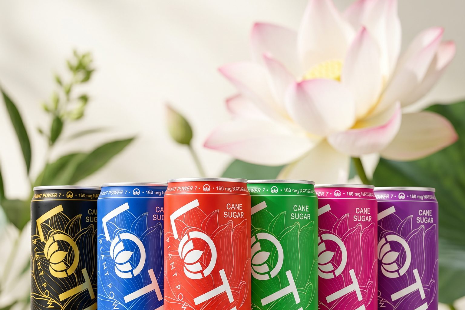
The strategy centers on one insight: packaging is point-of-sale merchandising. Unlike competitors built on flavor names, Lotus uses a color-driven portfolio system—Pink Lotus, Blue Lotus, Green Lotus, Red Lotus, Purple Lotus, Gold Lotus—that creates visual recognition, encourages sampling, and drives repeat purchase through personal connection rather than just caffeine promises.
Disrupting Traditional Energy Planograms
For decades, energy drink category management focused on flavor labeling and caffeine claims. Consumers chose products based on names like "watermelon blast" or "tropical citrus," with packaging changing drastically with every SKU launch.
Lotus approached this differently. By building a consistent packaging architecture where color becomes the hero, the brand created shelf presence that doesn't require constant graphic redesigns. This stability matters for c-store retailers managing limited shelf space and frequent planogram resets.
More importantly, the strategy has generated industry recognition for shelf impact within one of retail's most competitive categories.
Plant Power 7™: The Functional Benefit Behind the Look
Color alone doesn't build repeat traffic. The functional story does. At the center of Lotus's positioning is Plant Power 7™ (PP7™), a proprietary blend of certified organic plant-based ingredients: green coffee beans, guayusa, green tea extract, coffee fruit, elderberry, Jerusalem artichoke, and ashwagandha KSM-66.
This formulation aligns with the broader c-store trend toward better-for-you energy products. Today's convenience shoppers read labels more closely and seek products they can feel confident recommending to customers. Clean-label energy is no longer niche—it's becoming a baseline expectation.
The insight matters for your planogram: consumers are increasingly intentional about what fuels them. They want ingredients they recognize and feel good about, which means premium positioning and higher price elasticity for brands that can deliver it.
The "Lotus Glow™" as a Category Differentiator
Lotus positions energy as more than a functional jolt. The brand refers to the consumer experience as the Lotus Glow™—the idea that energy is reflected in how people connect, create, move, and express themselves throughout the day.
Translated to c-store merchandising strategy: this is an identity play, not just a caffeine play. Consumers choose the color that resonates with them personally, turning a beverage selection into a small form of self-expression at the register. That psychological lever drives higher attachment per transaction.
For retailers, this means Lotus customers aren't shopping price—they're shopping identity. That creates stickiness and reduces sensitivity to promotional pressure.
Packaging as an Impulse Trigger
The design philosophy is intentional: great packaging should evoke curiosity and function as an accessory. Lotus cans are built to be held, photographed, and carried—a consumer wants to identify with it publicly.
This directly supports impulse merchandising. Eye-catching, stable packaging architecture means better cross-merchandising opportunities (multi-pack displays, end-cap presentations) and reduced damage rates on high-traffic c-store shelves. The distinctive color system creates natural upselling: one customer tries Pink, another reaches for Blue, a third gravitates to Green.
The result: higher unit sales density per foot of shelf space.
Building Programmatic Advantage for Your Store
The future of energy category management isn't about stocking more SKUs. It's about creating direct consumer relationships through visual identity and functional integrity.
By combining Plant Power 7™ with a color-driven packaging system, Lotus connects what's inside the can with how customers express themselves at point of sale. Color-coded shelving is not just visual—it's a merchandising system.
Retailers deploying Lotus with intentional color-block planograms (grouping by color rather than traditional flavor families) are seeing improved sell-through and stronger repeat traffic. The philosophy is simple: energy is personal, and packaging should reflect that choice instantly.